First, how to visualize gravity incorrectly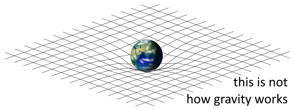
Gravity is illustrated incorrectly in almost all images published over the past century, ever since Einstein determined how gravity works. Only a few artists get it right, while hundreds of books and websites explaining gravity show visually compelling but logically baffling images. There are even videos with as many as 136 million views based on this confusing visualization, so it's safe to say pretty much everyone who thinks about gravity is familiar with "curving spacetime" as shown in the image above.
Since gravity is the last of the "four fundamental forces"[1] (the weak force, electromagnetism, the strong force, and gravity) not explained within the Standard Model of quantum mechanics, it seems important that everyone should have the most accurate information we have about it as we seek a solution. But instead, we're confronted with counterintuitive images like the "rubber sheet analogy" shown here. Such images are meant to help us understand gravity, yet lead us into logical and intuitive confusion instead.
The popular images are not just slightly wrong. In all such images, gravity is bending in the wrong direction, and its focal point is in the wrong place.
Yes, there is a degree of truth in the popular "rubber sheet" imagery. But it is wrong in a way similar to what we find in the ancient Indian parable of the blind men describing the elephant[2]. Images visualizing how gravity bends spacetime reveal only a partial truth, like we're listening to one of the blind men, while ignoring the others, and therefore unable to make something coherent with all the data points.
As simple as possible, but not simpler
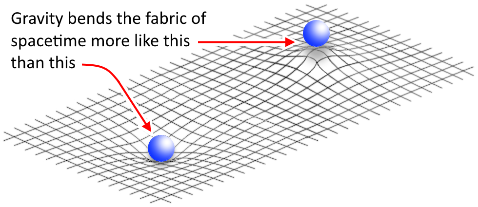 If you're like most people, as you look at the illustration to the right, you probably have a slight sense of puzzlement about the improvement you're seeing. The incorrect visualization is so common, it seems obviously more sensible than the more correct one.
However, the blue sphere with lattice lines pulled inward toward itself is technically more correct than the popular one with the lattice lines pulled away.
It's easy to see why: the grid is being pulled inward toward the center of the sphere, not around it, but toward it.
As a super-simple image, it's an improvement, but even the visual correction shown here is not the full story. There are important aspects of gravity's curve which are still not conveyed by this simplified 2D-plane visual.
How did we get here?
It's easy to see how the oversimplification happened: The common illustration began with smart people who understood the underlying 4-dimensional physics and transformed an abstract mathematical idea into something that could be understood by normal people.
Sadly, while following Einstein's description of spacetime, these smart people broke Einstein's equally wise advice on simplification: "Everything should be made as simple as possible, but not simpler."[3] As a consequence, the most common illustration of gravity is too simple.
Unfortunately, this rubber sheet illustration is as far as most people ever get into understanding Einstein's insight on gravity.
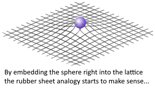 I used to be one of those people who didn't understand gravity largely because of the incorrect visualizations. For years when I saw such depictions of gravity I always wondered how in the world they worked. Something seemed "off" but I couldn't quite place what the problem was. However, it didn't seem important enough to pursue.
...Until one day I randomly came upon one of the rare "correct" illustrations (we'll see one below). Once that visual upgrade began working on my imagination, a whole lot of previously-unconnected concepts began to fall into proper place.
What happens when you visualize gravity correctly?
For the first time, I began to understand what "curvature of spacetime" means, how gravity bends spacetime, and even some glimpses into why gravity is not a force. Things began to make intuitive sense where before there was an elusive mystery.
Over time I was able to develop those glimpses more deeply and I now have a proper 3-dimensional understanding of gravity. It is quite different from what I knew before.
It's a coherent understanding that took years really. Now, gravity fits so much more nicely into other related studies in an important "cornerstone" kind of way, exactly as it should. The point here is that all started with one day randomly seeing the correct visualization.
For some people reading this article, that same moment will happen while reading. For such readers, I'm illustrating with incrementally improving images for the visual thinkers out there like me. By moving in increments, I hope to build a bridge between the two very different ways of processing information, making it easier to understand both worlds, so that a person doesn't need to spend a long time figuring it out.
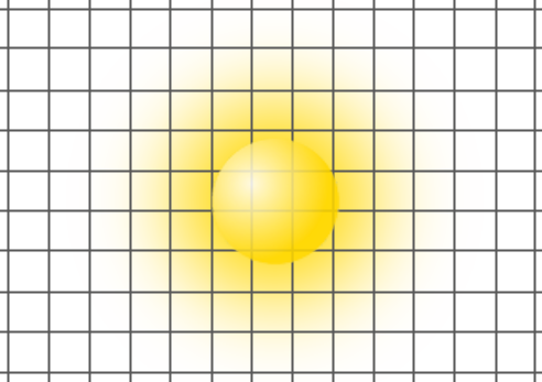 The most important thing missing in the popular model is the fact that the center of gravity is supposed to be at the center of the sphere, not at its outer surface.
However, think about what the picture would look like if the lattice went through the center of the sphere.
If we do that, what's there to curve around?
Study the image to the left for a minute and you'll see: The lattice has nothing to curve around when it goes through the center of the sphere. It technically goes through the center, but without a curve. Half right, half wrong.
So then, what do we curve around? Where does the curve come in?
The answer is the first step toward understanding how gravity actually curves space. Not "around" an object, but the object itself is compressed and the curve follows this compression.
Take a look: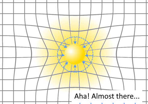
While making this new illustration, I have some questions: should we now make the sphere itself smaller? If so, spacetime is not just curved, it's... compressed inward...? What does this mean?
This is a completely new insight I've not yet seen written about anywhere, yet it's immediately obvious when the "curve" is represented correctly, focused on the center of the sphere.
This relationship between curvature and compression is just a guess, but what's most interesting to me is that there are entirely new insights coming out of this approach, insights which are hidden from the common 2D approach.
Visualizing gravity correctly
Finally. With all the pieces in place, let's take a look at the correct way to visualize gravity.
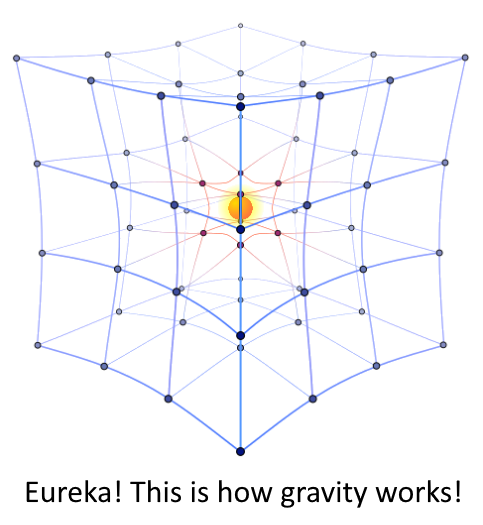 This is a correct visualization of gravity. Seen from a full 3D perspective, we can now understand how the phrase "gravity curves spacetime" might have been better if it were originally written as something like: "gravity compresses spacetime."
For readers who are new to this corrected version, go back to the illustration at the top of this article and compare this 3D visualization with that 2D one[4]. You'll immediately agree that the "2D" version is distorting important information.
How could we get it so wrong? After you've seen this image, you can see how a rubber sheet was never a good analogy. Yes, a sheet can stretch outward in the right ways (← →) which is the way we normally conceive of the word "stretch," but what we see above is not really a stretch outward.
It portrays the opposite of stretching, more like shrinking (→ ←), which is not a rubber sheet kind of idea.
The shrink/stretch issue becomes even more important when we look at an animated version of the "gravity cube" shown above. The animation can be seen in this insightful image from the Wikimedia site. In the animated version, you can see tiny clocks at each of the vertexes. See how the outer clocks are rotating faster than the inner ones, which is an important part of the overall insight.
A corrected look into gravitational lensing
Gravitational lensing is one of many pieces of gravity which experts can understand fully, even if they don't understand certain other pieces. However, the problem with visualizing gravity is so pervasive that artists show gravitational lensing incorrectly also. Below is a beautiful image I got from an article by Caltech's Spitzer telescope team. Again, these are people who should know better, if anyone does. But they're not the only ones who get this wrong.
The same image is used elsewhere by the Museum of Science. There is also a similar illustration shown in a video on the ESA/Hubble site. The video is less than a minute long, and it animates how the lensing happens. But it has the same mistake as the image below.
Yes, it is possible to animate how lensing happens accurately, but as long as artists keep trying to navigate around the wrong gravity concepts, they'll never get it right. Below, I marked up the Caltech image to show where they got it wrong:
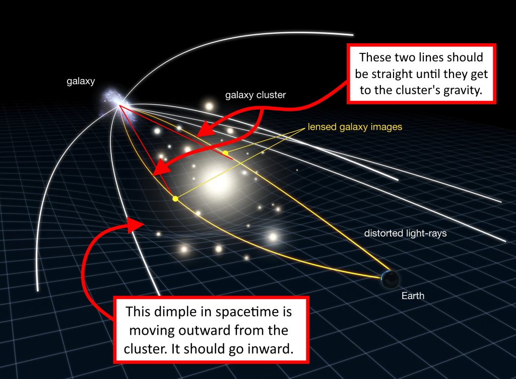
The first annotation, about the light rays, may seem to be a minor pedantic quibble. But it highlights a compounded point of confusion:
- Look at how the (parallel) lines in the lattice curve away from the plane (forming the dimple in spacetime) and then curve back again. This does not really happen, but the illustrator certainly thinks it does, as we have discussed above.
- Then notice how the illustrator made the (not parallel) yellow light rays do something similar, just with a longer arc. Gravitational lensing happens because the light rays moving in straight lines initially diverge and later encounter the gravity. The gravity source makes them converge by curving toward the galaxy cluster, not away as this illustration shows.
To be succint: by making the correctly diverging light rays move in a large arc similar to the parallel grid lines, the image seems more coherent, but becomes doubly-confusing to anyone trying to figure out the whole truth of the matter.
Is this making a mountain out of a molehill?
From what I can tell, even the smart people who direct the artists in what to draw get it wrong.
It seems safe to assume that there are many scientists, even experts in gravity, who think about gravity in conceptual pieces, but never in a coherent whole where all the pieces fit together. Then, an artist is supposed to bring these pieces together and comes up with something like this.
But so what if we visualize gravity a little poorly? The concept of spacetime curving is all we need to know, right? That part comes through, right?
Wrong. As shown above, the real problem here is not that we have a popular but lame illustration of spacetime curving, but that almost everyone thinks this is how spacetime curves. Same as I did, they give it no more thought because the model makes enough sense. However, now that I have made the transition into a better paradigm, and knowing how it took years to figure out, and seeing how there are already new insights percolating out of the correct visualization, I'm convinced that if all broken models were replaced with correct models, we would rapidly solve unsolved problems with gravity.
Perhaps we could even bridge the gap between Quantum Mechanics and the Theory of Relativity.
Footnotes:
- ^ According to Einstein's theory of Relativity, gravity is not a force. It's simply a curvature of spacetime. It can be modeled and measured as a force, but is not actually a force. Wikipedia puts it concisely: "Gravity is most accurately described by the general theory of relativity, proposed by Albert Einstein in 1915, which describes gravity not as a force, but as the curvature of spacetime, caused by the uneven distribution of mass, and causing masses to move along geodesic lines." We think it is a force for three reasons: 1. In Newtonian physics, it is a force. Understanding it as a force comes with Newtonian mathematics that works very well, even to this day. It works well enough to explain planetary orbits with a remarkable degree of precision. However, it doesn't work at the extremes where Einstein's solution does work, and there are other problems: (A). Newtonian physics assumes that gravity is instantaneous everywhere. In other words, for Newton, gravity moves at the speed of infinity. This is no longer commonly accepted, as the measurement of gravity waves shows they move at the speed of light. (B). All bodies experience the exact same gravitational effect no matter their weight, and Newton's theory cannot explain this. (C). Newton's force cannot explain why light -- which has no mass -- curves as it goes around a large stellar object. 2. Einstein brought us forward by a huge leap, but did not get us all the way there. With Einsteinian physics, we know gravity is not a force, but is instead a curvature of spacetime. This new approach neatly solves all three problems above. However, it's still downright confusing: How can something that has no properties curve? (A). Explanations in this area are mathematical and illustrations are counter-intuitive. For example, I've looked long and hard, far and wide, searching for intuitive images of how spacetime curvature works on things at the surface of our planet, and I've yet to find good answers. (I get how it works far away from the planet, shown in the image below, but not why it pulls things vertically at the surface, nor how it acts on articles at rest, and so forth). (B). Nobody fully understands Einsteinian gravity. We know that it works, and how it works, but not yet why, and at the quantum level we don't even know how. Wikipedia displays five separate problems under the heading "Quantum gravity" on its comprehensive list of unsolved problems in physics. (C). Gravitational lensing is an extremely well-documented proof of Einstein's spacetime curve predictions, and it works where Newton fails, so we know that it's right... but "gravity is not a force" is just downright confusing, with too many unanswered questions, so we avoid thinking of it this way if we can, which leads us to: 3. Popular, well-respected websites and science publishers call it a force. They should know better. Consider this web page from NASA, which is using Newtonian physics to talk about gravity (and using the rubber-sheet analogy in its image). Why doesn't everyone at NASA already understand the correct description of gravity -- including even their web designers? I think this goes back to #2 above: because of how confusing it is to talk about spacetime curving. For the common man, Newton's F=ma is sufficient for most purposes, so we still use it everywhere. Therefore, we continue to fall back on Newton's explanation of gravity, awaiting the day that someone figures out how to fully unpack Einstein's explanation so everyone can update their narratives. If you'd like to know more about how we know gravity is not a force, here is an insightful link from Universe Today.
- ^ One blind man says the elephant is hard and sharp like a spear because he encounters a tusk. Another says it is more like a snake because he encounters the tail or the nose. Another says it is broad and flat like a wall. Only when all of their perceptions are organized into one does it become clear they are all talking about the same thing.
- ^ Apparently, Einstein didn't actually say this famous quote. The Quote Investigator identified the original quote as something which ironically became more simple over time. Here is his original, from 1933: "It can scarcely be denied that the supreme goal of all theory is to make the irreducible basic elements as simple and as few as possible without having to surrender the adequate representation of a single datum of experience."
- ^ Yes, the dimple technically makes the 2D matrix into a 3D surface, but it's not a completely isometric 3D image like the correct one, so I call it "2D" for the sake of comparison.